Physitrack Rebrand


THE PROBLEMS
Although Physitrack is the leading provider of digital home exercise programme management for healthcare practitioners, the old branding did not reflect the company’s commitment to innovation and the future of digital health. All the company’s subsidiaries had different branding elements, which made it difficult for the group to be recognisable.
WIREFRAMES AND VARIATIONS
The creation of wireframes and multiple test variations helped us establish a clear design direction. The idea was to keep some elements from the old branding to maintain consistency with the current platform users, while exploring new ideas.
A NEW IDENTITY
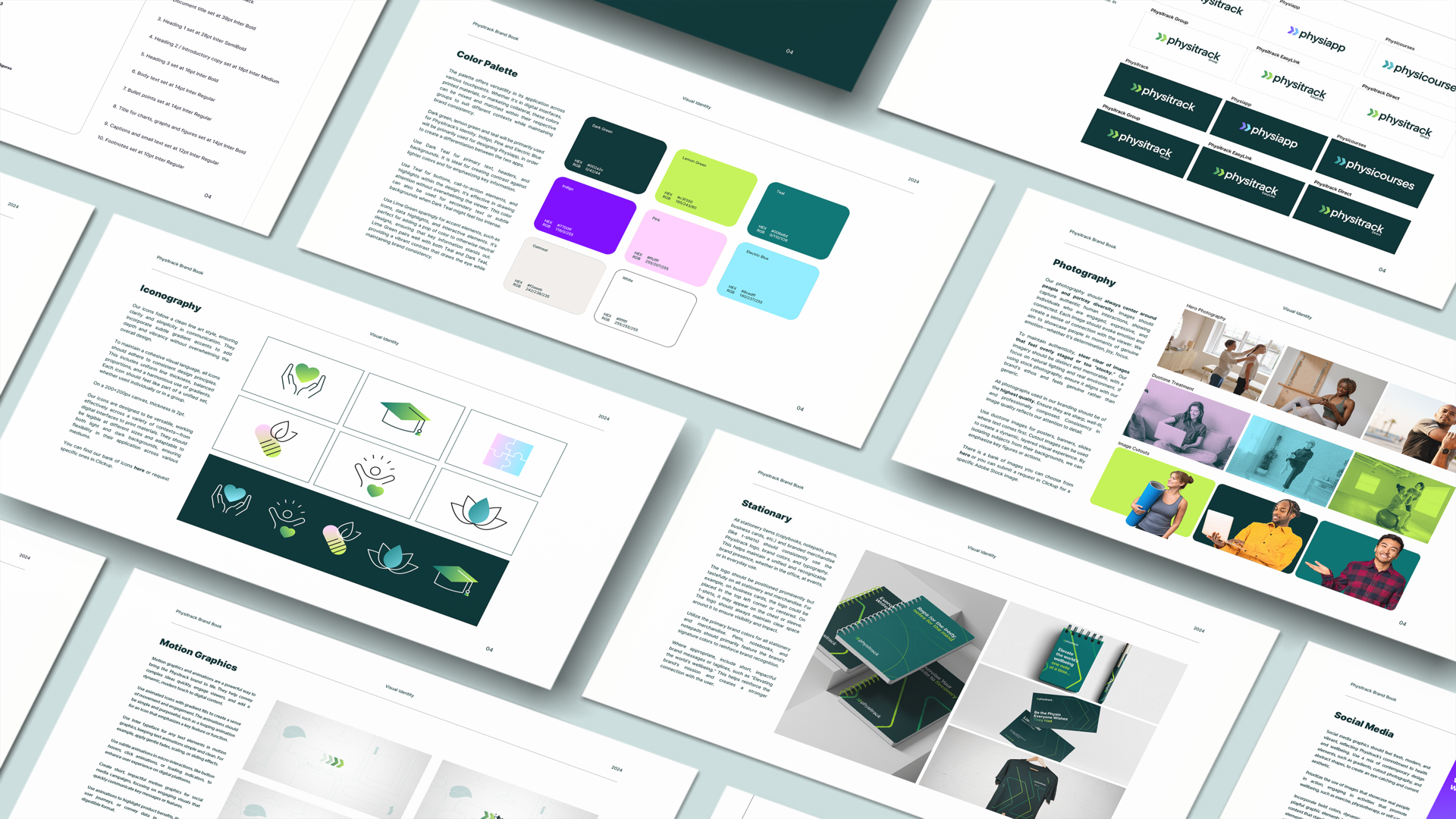
Physitrack’s new identity includes a new logo, color scheme, typeface and a comprehensive style guide for the whole group. All sub-groups have been re-branded as well in order to maintain consistency and be recognised as a group. The old green was still a part of the re-brand as a primary color and the small arrows from the old logo became the current logo mark, reflecting a sense of moving forward in the digital space. The colors have been chosen to emphasise boldness, tech and health and the palette offers versatility in its application across various touchpoints. A clean, rounded typeface for clarity and professionalism.
WEBSITE, SOCIAL MEDIA AND MANAGEMENT
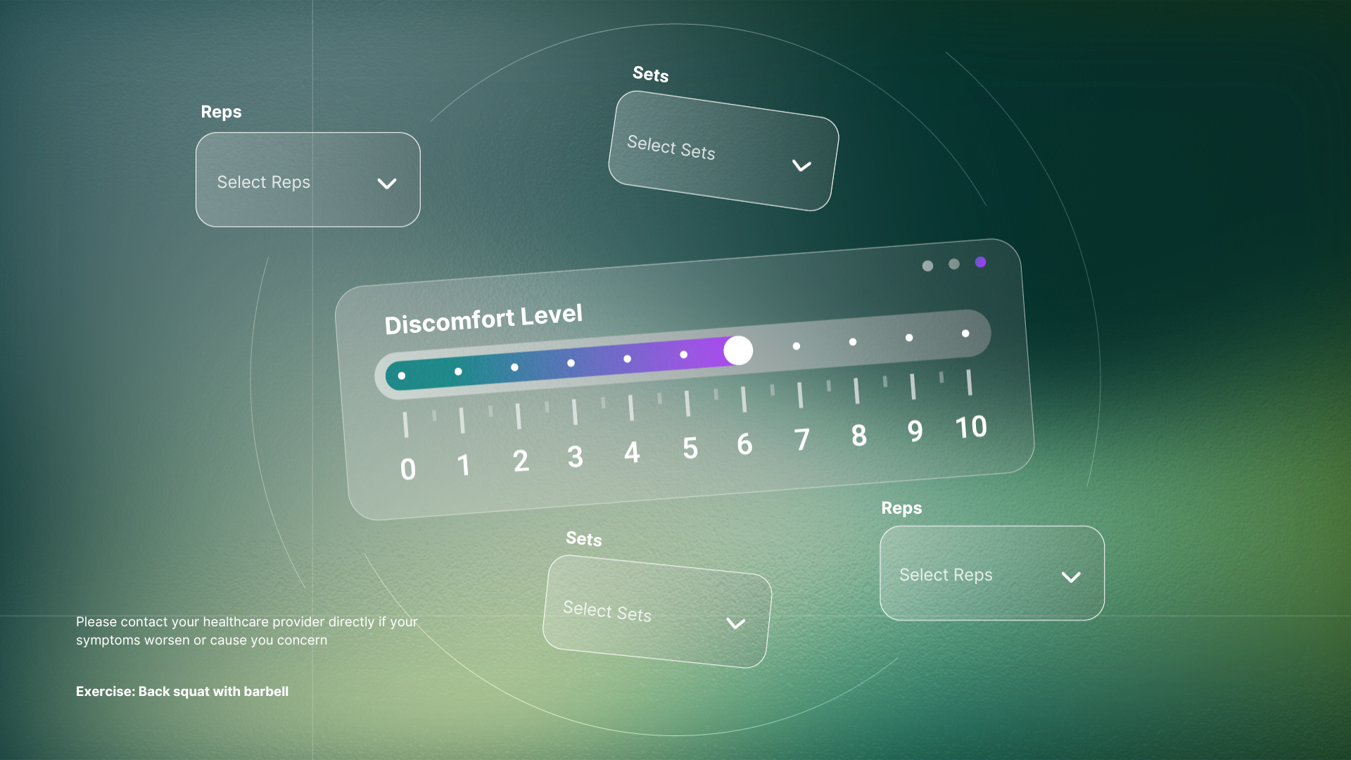
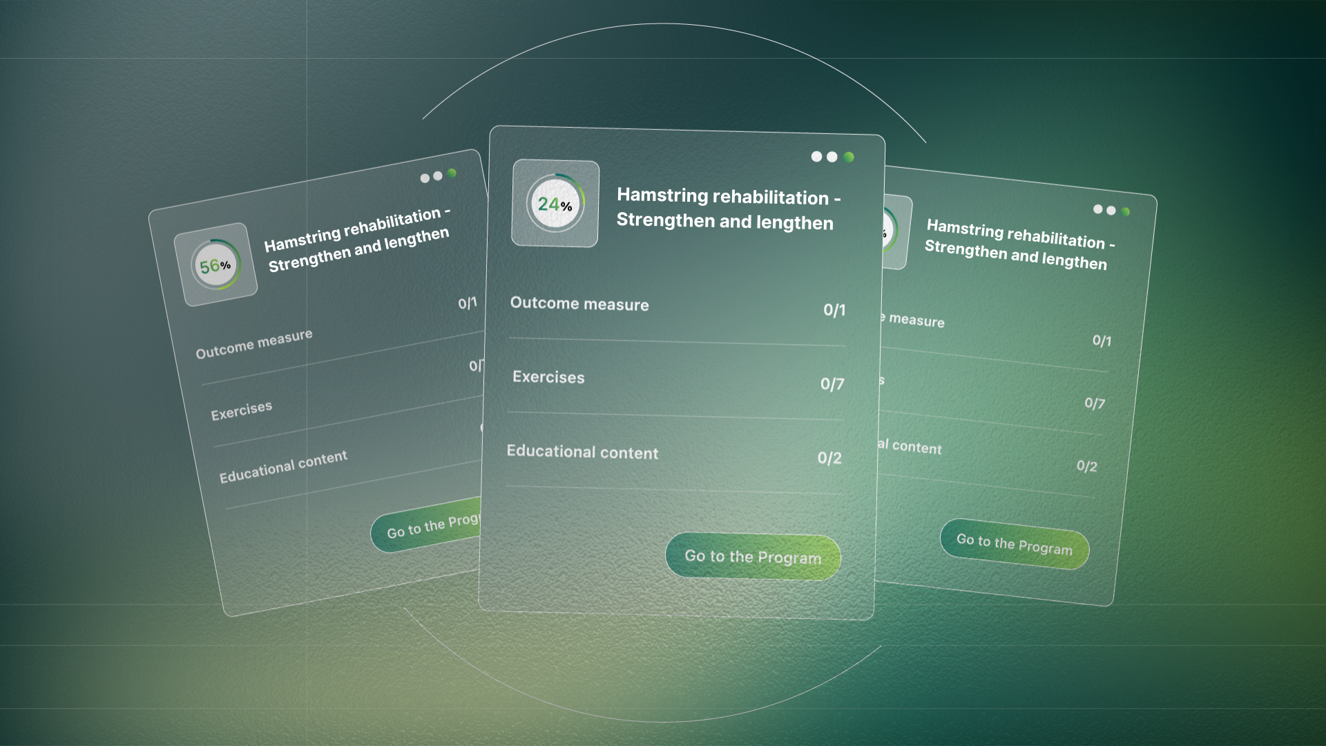
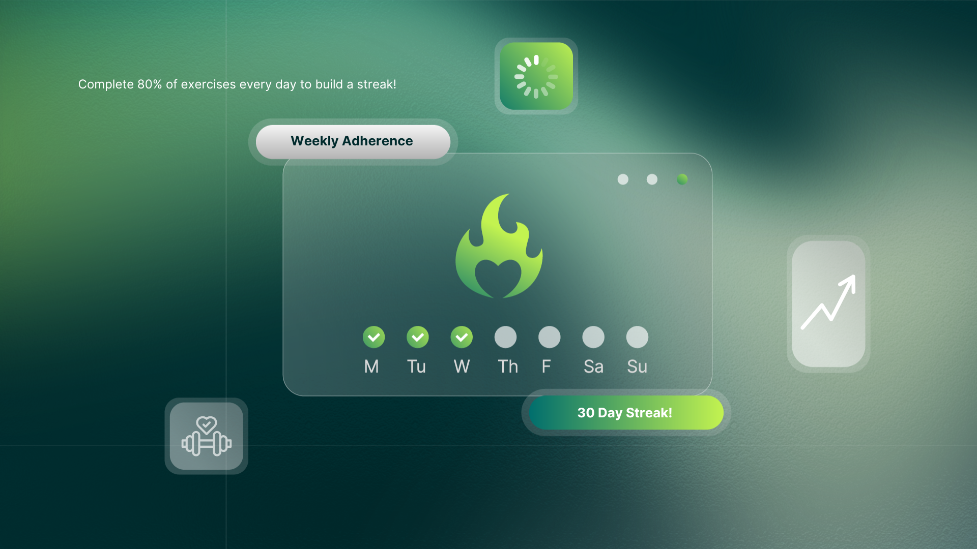
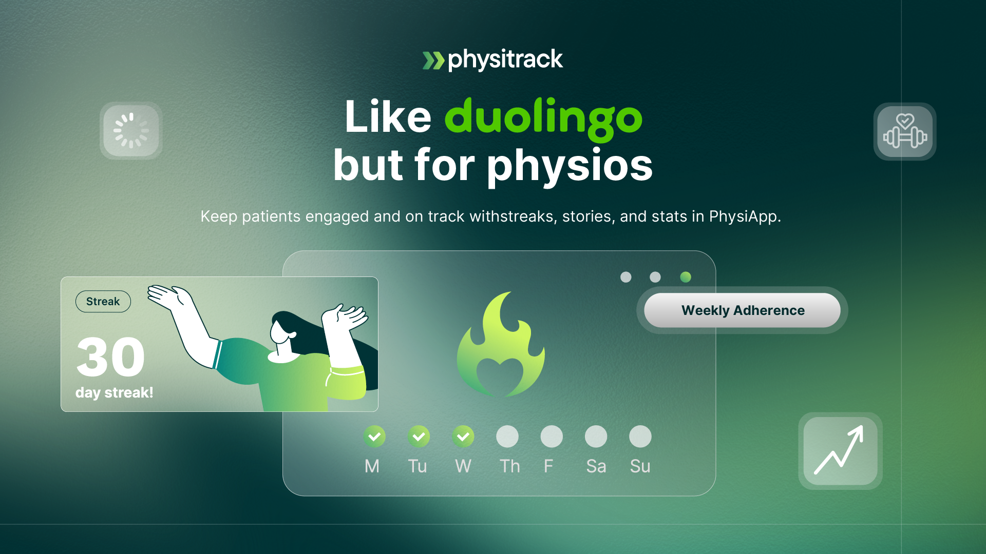
Once the identity was done, I moved on to create presentations, reports and social media templates, as well as centralise all graphics in order to streamline the design process within the group and make sure everyone has the right access to assets. I designed the website’s new homepage according to the new brand guidelines and released social media and marketing assets promoting Physitrack’s services and new identity.

